Project Brief
Design a corporate logo for an NLP training company
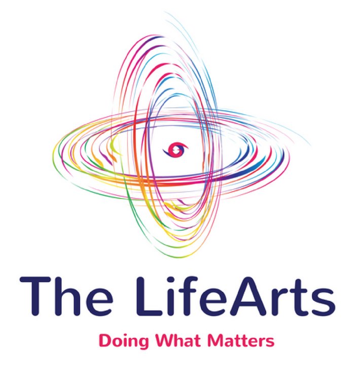
The LifeArts was a Neuro-Linguistic Programming training company in the United Kingdom. They wanted a logo that depicts the fact that there can be logic even behind utmost chaos.
We ideated the entire concept and decided to adopt a design that was chaotic in a rhythmic way. The resultant corporate logo had a stable centre point that showcased the stability that grounds every human being even in the busiest and most hectic days.